
Images are among the largest files transferred on many websites. If photos and graphics are uploaded without optimization, individual images can be several megabytes in size and unnecessarily increase a page's loading time.
However, good image optimization does not mean simply compressing images as much as possible. The key is a sensible compromise between image quality, dimensions, file size, and the file format used.
Images also play a role for search engines. Understandable file names, appropriate alternative texts, and a meaningful content context help to better categorize images and their meaning.
In this guide, we will show you how to prepare images for websites and which factors are important for quality, loading time, and SEO.
Briefly explained: An image optimized for the web has dimensions appropriate for its intended use, a suitable file format, and the smallest possible file size without unnecessarily compromising visible quality.
Why should images for websites be optimized? #
Digital cameras and modern smartphones produce images with very high resolutions. This makes sense for photography, editing, and printing, but is often unnecessary for display on a website.
For example, a photo can be several thousand pixels wide, even though it is displayed on the website at a significantly smaller maximum width.
If the large original file is still transferred, the browser has to download significantly more data than would be necessary for the actual display.
This can be noticeable, particularly with mobile connections.
Image dimensions and file size are not the same #
When optimizing images, you should distinguish between two terms:
Image dimensions describe the width and height of an image in pixels.
Example:
1920 × 1080 pixels
The File size describes, on the other hand, how much storage space the image file requires.
Example:
280 KB
Two images with identical pixel dimensions can have very different file sizes. This depends, among other things, on the image content, file format, and compression used.
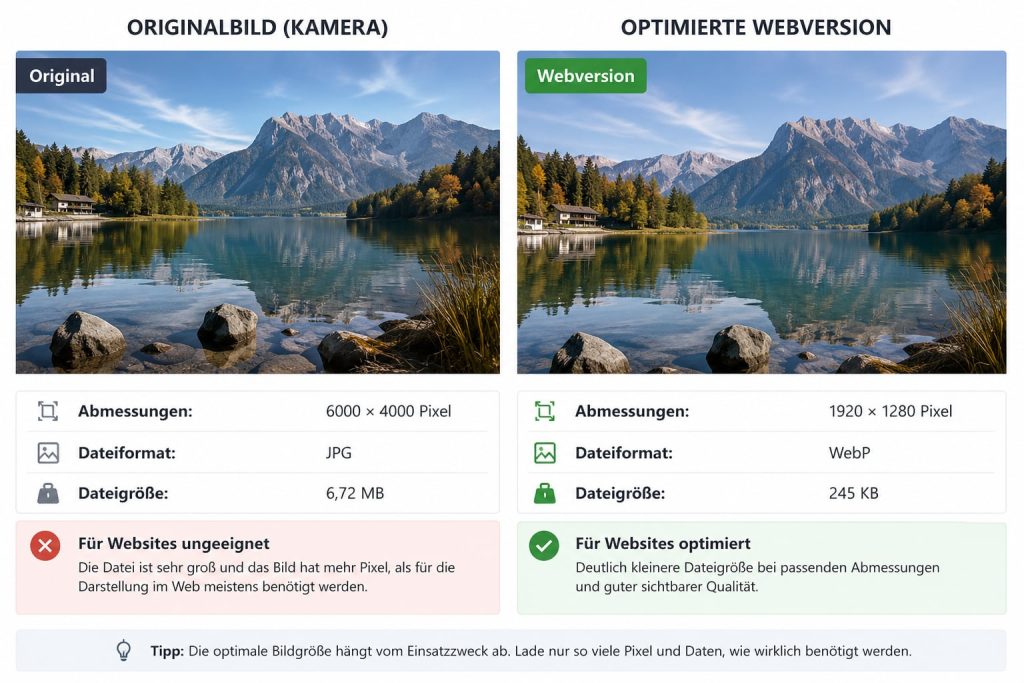
Important: An image is not web-optimized simply by reducing its file size. Unnecessarily large pixel dimensions should also be avoided.
How large should an image be for a website? #
There is no single pixel size that is right for all website images.
The required dimensions depend on where and how the image is displayed.
A small thumbnail requires different dimensions than a large full-width hero image on a website.
The basic rule is:
Practical Tip: Do not provide significantly more image data than is actually required for the intended display.
Do not upload original photos without checking them first #
For example, a modern smartphone can produce a photo with a width of several thousand pixels.
If this image on your website is only displayed within a content column, the full original resolution may be unnecessary.
Before uploading, you should therefore check which maximum display size makes sense for the specific intended use.
Consider high-resolution displays #
When choosing image dimensions, however, you should not only consider the visible CSS display width.
Modern devices can have high-resolution displays on which additional image information can be useful for a sharp display.
Therefore, the blanket rule „always reduce the image size to exactly the visible pixel width“ would also be too simple.
Modern websites can also provide different image variants for different display sizes or resolutions.
What are responsive images? #
Responsive images allow the browser to select an appropriate image variant depending on the device, display size, and other factors.
Technically, HTML mechanisms such as this can be used, for example, srcset and sizes be used.
Simplified:
small display
      ↓
smaller image variant

larger display
      ↓
larger image variant
Many modern content management systems generate or use such variants automatically. Nevertheless, you should not assume that this automatically optimizes any arbitrarily large original file.
Which image format should I use? #
Several image formats are available for websites. They have different characteristics and are therefore not equally well suited for every type of content.
Formats that are particularly relevant today include:
JPEG / JPG
PNG
WebP
AVIF
SVG
Which format makes sense depends, among other things, on whether it is a photo, a graphic, a logo, or an image with transparency.
We cover the differences between WebP, AVIF, JPEG, and PNG in detail at WebP, AVIF, JPG and PNG: Which image format to use?.
JPEG or JPG #
JPEG has been a common format for photos for many years.
It uses lossy compression. This allows the file size to be significantly reduced, whereby image information is lost depending on the compression level.
JPEG is particularly suited for photographic subjects with many colors and color gradients.
Classic JPEG, on the other hand, is not suitable for graphics with transparency.
PNG #
PNG uses lossless compression and supports transparency.
The format is suitable, for example, for certain graphics, screenshots, or content where sharp edges or transparency are important.
However, with large photographs, a PNG file can be significantly larger than a reasonably compressed alternative.
Therefore, a photo should not automatically be saved as a PNG just because this format is well-known.
WebP #
WebP is a modern image format for the web and supports both lossy and lossless compression as well as transparency.
With appropriate settings, this often allows for smaller files than with older formats, without having to reduce the visible quality to the same extent.
WebP is widely supported by modern browsers and is therefore a practical option for many website applications.
AVIF #
AVIF is another modern image format that can enable efficient compression.
Especially with photographic content, very small files with good visible quality can be achieved with a suitable configuration.
However, that does not mean AVIF is automatically the best choice for every image. Encoding effort, image content, desired quality, and the website's technical workflow also play a role.
SVG for logos and vector graphics #
SVG is fundamentally different from traditional raster images.
It is a vector format. Shapes and lines are described mathematically or as structured vector data rather than being saved as a fixed grid of individual pixels.
This allows suitable SVG graphics to be scaled without the typical loss of quality of a raster image.
SVG is suitable, for example, for logos, icons, and certain illustrations.
Attention: SVG files can contain active or complex content. Only use SVG files from trusted sources and observe the security mechanisms of your CMS or website application.
Not every image format is suitable for every content #
A simple orientation:
| Image type | Frequently suitable formats |
|---|---|
| Photo | WebP, AVIF, JPEG |
| Graphic with transparency | WebP, PNG, AVIF depending on content |
| Logo or icon as vector graphic | SVG |
| Screenshot | PNG or WebP, depending on the content |
This table serves as a guide and is not a rigid rule. A concrete quality and size comparison can be useful for important images.
What does image compression mean? #
During compression, image data is saved in such a way that the resulting file requires less storage space.
A distinction is made between lossless and lossy compression.
Lossless compression #
With lossless compression, the image data is compressed in such a way that the original information can fundamentally be restored.
Lossy compression #
With lossy compression, image information is removed or simplified in order to achieve smaller files.
The stronger the compression, the more likely visible artifacts or loss of quality can occur.
The smallest file is not automatically the best file #
The goal of image optimization is not to produce the smallest possible file at any cost.
A photo with extremely high compression can be very small, but it can visibly lose quality.
Therefore, you are looking for a sensible compromise:
good visible quality
+
suitable dimensions
+
efficient format
+
appropriate compression
=
well-optimized web image
Check image quality after compression #
Do not rely exclusively on a percentage value from an image editing program.
A quality level of „80,“ for example, is not directly comparable across all programs, codecs, and formats.
Visually check the finished image.
Pay special attention to:
unsightly blocking
washed-out details
color banding in gradients
ragged edges
text that becomes difficult to read
visible artifacts
Why large images affect loading time #
Image files must be transferred from the server to the browser.
The more data that needs to be transferred for a page, the more significant an impact this can have, especially on slower or mobile connections.
Assuming a page contains multiple unoptimized images:
Image 1: 4.0 MB
Image 2: 3.2 MB
Image 3: 2.5 MB
Image 4: 3.8 MB

Total: 13.5 MB
These four pictures alone already generate a significant amount of data.
If the same images can be provided significantly more efficiently with comparable visible quality, this can substantially reduce the amount of data transferred.
Do not set a flat maximum file size #
On the internet, you can find recommendations like „every image must be under 100 KB“ or „images can be a maximum of 200 KB in size“.
Such strict limits are too generalized.
A small thumbnail image and a large, detailed hero photo serve completely different purposes.
Therefore, the question should not be:
„Is this image under a specific KB limit?“
Rather:
„Is this file unnecessarily large for its specific intended use?“
What does lazy loading mean? #
In simple terms, lazy loading means that certain images are only loaded when they are needed or when they approach the visible area.
This means that not all images further down the page necessarily need to be loaded completely right away upon the first page view.
visible area
[ Image is required ]

further down
[ Image can be loaded later ]
Modern browsers support, for example, the attribute for suitable HTML images loading="lazy".
Not every image should be blindly lazy-loaded #
An image that is needed immediately in the visible upper area when a page loads should not be unnecessarily delayed without checking.
This particularly affects important visual content in the above-the-fold area of a page.
Lazy loading is therefore an optimization technique that should be used sensibly, and not a switch following the principle of „the more, the better.“.
Images and Core Web Vitals #
Images can also affect the Core Web Vitals used by Google.
A large visible image can be relevant, for example, to the Largest Contentful Paint metric.
If suitable size information for images is missing, layout shifts can also occur during loading.
We cover Core Web Vitals in detail under Core Web Vitals Explained: LCP, INP and CLS.
Width and height in HTML can reduce layout shifts #
If the browser already knows the dimensions of an image before it is fully loaded, it can account for the required space in the layout early on.
For example, in a normal HTML image, the attributes width and height help determine the aspect ratio or the required space.
Modern CMS and website systems often handle this automatically. Nevertheless, in the case of noticeable layout shifts, it is worth checking how images are embedded.
Images and SEO #
Image optimization for search engines is not just about making files as small as possible.
Search engines consider various pieces of information to understand the content and context of a page or an image.
These include, among other things, the surrounding page content, the technical integration, and descriptive information about the image.
Use meaningful file names #
A descriptive file name can help classify an image file both organizationally and in terms of content.
Not very meaningful:
IMG_847293.jpg
More clearly:
webhosting-cpanel-dashboard.webp
The file name should describe the actual image content. Avoid artificial strings of keywords.
What is an alt text? #
The HTML attribute old provides a textual alternative for an image.
A simplified example:
<img
  src="cpanel-dashboard.webp"
  alt="Overview of the cPanel Dashboard"
>
Alternative texts are particularly important for accessibility, for example when a screen reader conveys the content of a page or an image cannot be displayed.
How do I write a good alt text? #
The alternative text should convey the relevant content or purpose of the image in the respective context concisely and comprehensibly.
Bad:
Image
Also bad:
Web hosting Hosting Switzerland best hosting cheap hosting cPanel
Better with a corresponding screenshot:
Overview of the cPanel Dashboard
An alt text is not a field for accumulating as many search terms as possible.
Important: Write alternative texts primarily in such a way that they meaningfully convey the purpose or relevant image content. Accessibility and comprehensibility are more important than keyword stuffing.
Decorative images require different treatment #
Not every image conveys relevant information.
For purely decorative images, empty alternative text can make technical sense so that assistive technologies can skip the image.
In HTML, for example, this could look like this:
alt=""
Whether an image is decorative or content-relevant depends on its function in the specific page context.
Do not embed text into images unnecessarily #
Important information should, if possible, be present as actual HTML text on the website and not solely within a graphic.
This has several advantages:
Text can be scaled better
Text can be copied
Screen readers can process it
Translations are easier
Content can be displayed more responsively
Search engines receive direct text content
Graphics with text can of course be useful. However, critical information should not be hidden exclusively within them.
Use images in the correct page context #
An image should match the content of the page.
A screenshot of the cPanel dashboard is useful, for example, in a tutorial about cPanel. That same screenshot does not provide any additional context on a completely unrelated page.
Captions can also be useful if they provide visitors with additional information.
Image optimization and PageSpeed #
Analysis tools can indicate that images could be encoded more efficiently, resized differently, or provided in a more modern format.
You should evaluate such notes in the context of the actual website.
We will explain how to correctly interpret load time measurements later at Measure website loading time and evaluate it correctly.
We also cover how to use Google PageSpeed Insights under How to use Google PageSpeed Insights correctly.
Do not blindly optimize PageSpeed scores #
An analysis tool is a diagnostic aid and not an end in itself.
It does not make sense to compress a visibly important image so heavily that the quality suffers significantly just to improve a single metric.
Always evaluate the actual benefit of an optimization.
Metadata in image files #
Image files can contain additional metadata, such as information about the capture or the software used.
Depending on the intended use, such metadata may contain unnecessary data or reveal information that you do not want to publish.
Therefore, when dealing with images for a public website, it can make sense to check which metadata is actually included and required.
Privacy Tip: Check, especially in the case of private images or those taken with smartphones, whether metadata is contained that you do not want to make publicly available.
Don't forget image rights and licenses #
Technical optimization says nothing about whether you may legally use an image.
Use only images for which you own the necessary rights for publication or whose license permits the planned use.
Note any required copyright notices or attributions, if applicable.
Keep original files separately #
When scaling down and compressing a high-quality original photo for the web, you should not necessarily replace the original file with the optimized version.
Keep high-quality source files separate in case you need a different size, crop, or higher-resolution version later.
The web version is an edition optimized for a specific use case—not necessarily your archive original.
Do not compress images unnecessarily multiple times #
With lossy formats, repeated opening, editing, and strong recompression can progressively degrade image quality.
Therefore, if possible, generate new web versions from a high-quality source file.
Generate web version

better than:

already heavily compressed file
   ↓
compress again
   ↓
compress again
Optimize screenshots for manuals #
With screenshots, it is particularly important that the relevant controls and text remain easily readable.
Cut away unnecessary areas before you downscale the screenshot.
A targeted crop is often more helpful and smaller than a complete screenshot on which the relevant area is barely recognizable.
Also, make sure not to accidentally publish any confidential information, customer data, access credentials, or other sensitive content in the screenshot.
Pay special attention to hero images #
Large images in the upper visible area of a page deserve special attention.
They can take up a significant portion of the visible area and are required immediately upon page load.
Here you should carefully weigh image quality, dimensions, and file size.
Simply compressing such an image to be extremely small or applying lazy loading across the board is not automatically the best solution.
Don't forget the wallpapers #
Images can be embedded not only via a regular HTML image element.
CSS background images can also cause large data volumes.
Therefore, if an analysis tool indicates a high level of image transfer, you should also take background graphics, sliders, and other visual elements into account.
Sliders can load multiple large images #
A slider can contain several large-format images. Depending on its technical implementation, this can result in multiple files being loaded as soon as the page is accessed.
Therefore, check whether all the slider images used are actually needed and sensibly optimized.
More images do not automatically mean a better website.
Image optimization for online stores #
In an online shop, product images can account for a significant portion of the transmitted data.
At the same time, customers must be able to evaluate products in sufficient detail.
Excessive compression can therefore be just as problematic as unnecessarily large original files.
Especially with many products, a consistent workflow for dimensions, format, and quality is helpful.
Image optimization for blogs and guides #
For longer articles, many individual images can add up to a considerable total size.
This applies, for example, to step-by-step instructions with numerous screenshots.
Here it is worth cropping every screenshot to the actually relevant area and using a suitable web version.
Compare before and after #
For important images, you can compare the original and optimized versions.
Example:
4000 × 2667 pixels
4.8 MB

Web version:
suitable dimensions
efficient format
420 KB

visible quality:
comparable for the intended use
The numbers are just an example. What matters is not a specific target value, but whether the optimized file fulfills its purpose with a significantly more efficient data volume.
Test website after image optimization #
After making changes, you should actually visit and check the website.
Check in particular:
Image quality
Correct image section
Desktop display
Smartphone display
Galleries and sliders
Links to images
Layout shifts
Loading behavior
A technically smaller file offers no advantage if, for example, the wrong section is displayed afterwards or important details are barely recognizable.
Common mistakes in image optimization #
Typical problems include:
Upload original photos directly from the smartphone

Huge pixel dimensions for small displays

Unnecessarily saving photos as large PNG files

Over-compressing images

Using the same quality value for every image

Keeping file names like IMG_12345

Overloading alt texts with keywords

Lazy-loading every single image indiscriminately

Displaying text exclusively as an image

Overlooking large background images

Deleting original files after optimization
Practical workflow for new website images #
Select image
        ↓
Determine purpose
        ↓
Define suitable dimensions
        ↓
Choose appropriate format
        ↓
Compress sensibly
        ↓
Check quality
        ↓
Assign meaningful file name
        ↓
Upload to website
        ↓
Set alt text according to context
        ↓
Check desktop and smartphone
        ↓
Control loading behavior
Optimize existing website with many images #
If your website already contains many images, you do not necessarily need to process every file simultaneously without prioritization.
Start with the pages and images where the greatest benefit is expected.
These could be, for example, frequently visited pages, particularly large hero images, or pages with a noticeably high amount of transferred data.
Measuring the website can help identify the actual pain points.
If the website remains slow despite optimized images #
Images are only one potential factor in loading time.
A website can be slow despite well-optimized images if, for example, other resources, external services, JavaScript, database queries, or the application itself are causing issues.
We will cover systematic troubleshooting later under Slow website: systematically finding the causes.
Important: Image optimization is an important part of website performance, but not the universal solution for every loading time problem.
Image Optimization Checklist #
Does the image match the content?
        ↓
Do the dimensions make sense?
        ↓
Is the format suitable?
        ↓
Is the compression appropriate?
        ↓
Does the quality remain sufficient?
        ↓
Is the file name understandable?
        ↓
Is a meaningful alt text present?
        ↓
Have unnecessary metadata been checked?
        ↓
Does the image work responsively?
        ↓
Is lazy loading used sensibly?
        ↓
Tested on desktop and smartphone?
        ↓
Loading behavior checked?
Summary #
Well-optimized images can significantly reduce the amount of data transferred by a website and thereby contribute to better loading performance.
Crucial here are not only the file size, but also appropriate pixel dimensions, a suitable image format, and sensible compression.
JPEG, PNG, WebP, AVIF and SVG have different characteristics. The right format therefore depends on the respective image and its intended use.
For SEO and accessibility, you should also consider clear file names, meaningful alternative texts, and appropriate content context.
Techniques like responsive images and lazy loading can further optimize delivery, but they should not be applied without regard to the specific use case.
The best image optimization doesn't just reduce kilobytes. It delivers the required image quality to the visitor with as little unnecessary data as possible.


