
The design determines the overall visual impression of your Kopage website. This includes, among other things, the template or theme used, colors, fonts, header, navigation, and other design elements.
In the classic Kopage website builder, you can adjust many of these settings via the user interface without having to write CSS or HTML yourself.
In this guide, we explain how the various design areas are connected and what you should watch out for when changing the appearance of an existing Kopage website.
Briefly explained: Design changes can affect several or even all pages of your website. Individual texts, images, and content blocks, on the other hand, are edited as content.
What is part of the design of a Kopage website? #
Design is not just about choosing a color.
Several design elements together determine how your website is perceived. These include in particular:
- Template or theme,
- Colors and color scheme,
- Fonts,
- Header,
- Navigation and menu design,
- Backgrounds,
- as well as further global layout settings.
To be distinguished from this are the actual contents of your website. Texts, images, forms, or individual content blocks are not fundamental design settings, even though their styling naturally also influences the appearance.
What is a template or theme? #
A template or theme forms the design foundation of your Kopage website.
It defines basic visual properties and ensures that you do not have to develop every page and design element completely from scratch.
You can use an existing design as a starting point and then adapt it to your own website.
This is especially helpful for beginners: instead of having to develop a complete web design first, you can focus on colors, fonts, content, and the structure of your website.
Important: A template is a design foundation and not a replacement for your own content. Texts, images, page structure, and navigation should always match your company or project.
Which template should I choose? #
When making your selection, you should be less impressed by sample images or sample texts and pay more attention to the fundamental structure.
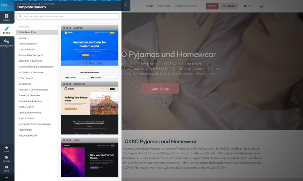
A sample image can be swapped out later. More important is whether the basic design fits your planned website.
Pay particular attention to whether the header, navigation, content width, and overall design meet your expectations.
For a small business website, for example, a clear and calm design can be more sensible than an elaborate template with many visual effects.
Change the template of an existing website #
For an already established website, you should not treat a template change the same way as choosing the design for a new website.
A template influences fundamental design properties. Therefore, before making a major design change, you should carefully examine what impact the chosen change will have on your existing website.
Then check in particular:
- Home page and important subpages,
- Header and navigation,
- Font sizes and line breaks,
- Images and content blocks,
- Footer,
- as well as the display on smartphones and tablets.
Attention: On an existing website, never adopt an option to replace or overwrite existing content without first carefully checking what this function changes. Design changes and replacing website content are two different processes.
Adjust colors in Kopage #
Colors are among the most important components of a consistent web design.
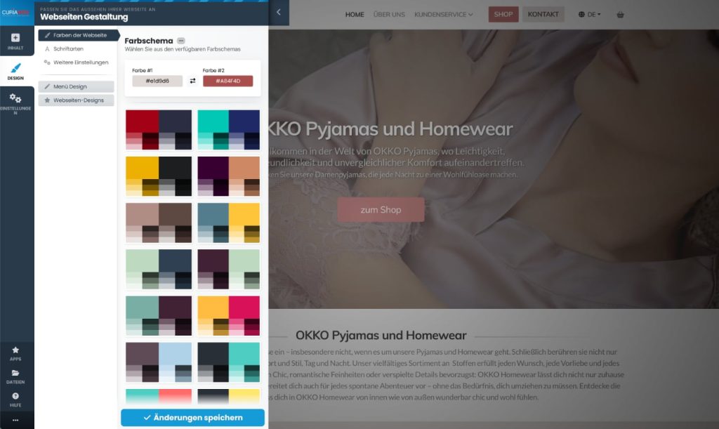
Kopage provides various color options or color schemes for this purpose. In addition, you can customize the appearance to match your own colors.
If your company already has a corporate design, you should use the same primary colors on your website whenever possible.
Typically, you only need a manageable color palette:
Primary color
Accent color
Background color
Text color
where applicable, an additional neutral color
Too many different colors quickly make a website look busy.
What color should I use for buttons and links? #
Interactive elements should be easily recognizable for visitors.
If your primary color is used for buttons, for example, you should keep this usage as consistent as possible across the website.
A button should not be blue on one page, green on the next, and red on a third page unless there is a design reason for it.
The same applies to links and other elements that visitors can interact with.
Practical Tip: Do not use colors just for decoration. A recurring accent color can help visitors recognize buttons, links, and important actions more quickly.
Ensure sufficient color contrast #
A color combination can look visually appealing and still be poorly readable.
A sufficient contrast between text and background is particularly important.
Light text on an almost equally light background or dark text on a very dark surface unnecessarily makes reading difficult.
This affects not only normal texts, but also buttons, navigation, forms, and other interface elements.
Therefore, after changing the color, check not only whether you like the color, but also whether all texts and functions remain clearly recognizable.
Change fonts in Kopage #
The font also has a major influence on the impact of a website.
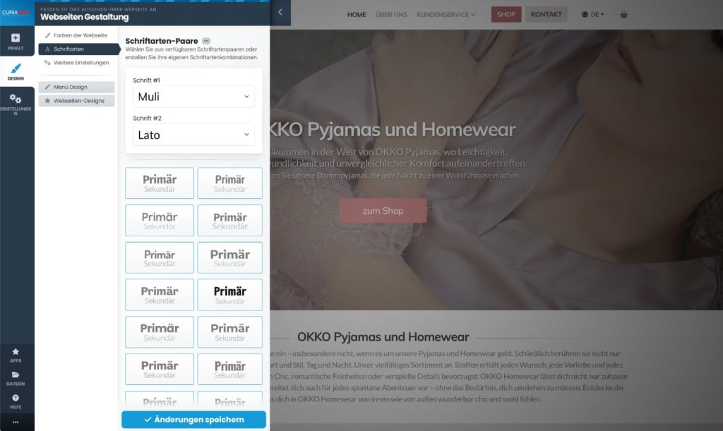
Kopage provides various fonts for design. This allows you to adapt the typographic appearance to your website without having to manually integrate custom web fonts.
When making the selection, readability should be more important than a fancy appearance.
A decorative font can work for individual design elements, for example, but is often unsuitable for longer running text.
Do not combine too many fonts #
For most websites, one or at most two well-coordinated fonts are enough.
A possible breakdown, for example, is:
Headings → Font A
Body text → Font B
However, you can also use a single font family for the entire website and differentiate headings by size and font weight.
What is crucial is that the design remains consistent.
Practical Tip: A legible and consistently used font usually looks more professional than several eye-catching fonts on the same website.
Distinguish between headings and body text #
Good typography helps visitors quickly grasp the structure of a page.
Main headings should stand out clearly from normal body text. Subheadings additionally structure longer content.
In doing so, you should not only visually enlarge headings, but use the intended heading formats.
A meaningful content structure is not only important for readability, but also helps search engines better understand the layout of a page.
Design the website header #
The header is the upper area of your website and is one of the elements that visitors see particularly often.
Depending on the design used, the logo, navigation, and other elements may appear there, for example.
The header should remain clear and quickly convey to visitors which website they are on and how to get to the most important areas.
A very large header with many elements can take up an unnecessary amount of space, especially on smaller screens.
Use logo in header #
If you have your own company or club logo, you should use a suitable image file for it.
Make sure in particular that the logo is sufficiently sharp and does not have unnecessarily large file dimensions.
For logos with a transparent background, an image format that supports transparency is suitable.
Also, check whether the logo remains clearly recognizable both on the selected header background and on smaller displays.
Consider navigation and header together #
Navigation is frequently part of the header. Therefore, both areas should match each other in design.
The menu must be easy to read and should not be cluttered with an unnecessarily large number of main items.
If your website has many pages, you can structure content using subpages or submenus.
We explain how to structurally set up pages and menus under Managing pages, navigation, and submenus in Kopage.
Design footer #
The footer is located at the bottom of a website and is often displayed on several or all pages.
Depending on the structure, contact information, additional navigation elements, or other recurring information can be housed there, for example.
Here too, less is often more. The footer should provide useful information and not become a second, overloaded homepage.
When you change global footer content, check several pages of your website afterwards.
Using backgrounds correctly #
Background colors and background images can visually separate individual areas of a website from one another.
However, they should support the content and not distract from it.
When using background images, you must pay special attention to the readability of any text placed on top of them. A busy photo behind a longer block of text can significantly reduce readability.
The file size of a background image should also be taken into account, as unnecessarily large images can increase a website's loading time.
Customize Content Blocks #
In addition to the global design settings, you can also influence the appearance of individual content areas.
This makes it possible, for example, to visually highlight a specific section without changing the entire website's theme.
This distinction is important:
Global design change
→ affects the fundamental appearance

Content block adjustment
→ affects a specific content area
We explain in detail how content blocks are structured and edited at Create content with Kopage: editing content blocks, texts, and images.
Images as part of the design #
The selection of your images also significantly influences the appearance.
Try to use a consistent image style as much as possible. Vastly different image qualities, formats, or styles can look disjointed even with a good template.
Also, you shouldn't upload images unnecessarily large. For a normal website, a photo doesn't need to be provided in the original size of a modern camera.
We cover image management, as well as galleries and sliders, under Creating images, photo galleries, and sliders in Kopage.
Check design on smartphone and tablet #
Kopage works with responsive website designs. Nevertheless, you should check your design on different screen sizes.
Especially after changes to the header, navigation, font sizes, images, or extensive content blocks, checking on smaller displays is important.
For example, pay attention to whether:
- Break headings appropriately.,
- texts remain easily readable,
- Images are displayed correctly,
- Buttons are easy to operate,
- and the navigation continues to work clearly.
You can find a detailed guide on this at Responsive Design: Optimizing Kopage website for smartphones and tablets.
Design and search engine optimization #
Web design and SEO are not completely separate topics.
A clear page structure, readable content, correctly used headings, and understandable navigation not only help visitors, but also create a better foundation for search engines.
However, pure design decisions do not replace search engine optimization.
We therefore treat page titles, metadata, and other SEO settings separately under SEO with Kopage: Page titles, metadata, URLs, and search engine optimization.
Custom CSS adjustments #
For the normal design of a Kojak website, you do not need any CSS knowledge.
However, if you want to make very individual customizations and have the appropriate knowledge, Kopage offers options for your own code.
You should only use such adjustments when the desired result cannot be reasonably achieved using standard design features.
Attention: Custom CSS or JavaScript code can affect the appearance or function of your website. Only use custom code if you understand its effects.
We cover the use of proprietary code separately under How to use custom HTML, CSS, and JavaScript in Kopage.
Common mistakes when designing a website #
Many design problems do not arise from a lack of features, but from too many design ideas being used at the same time.
Typical examples are too many colors, several different fonts, very large headings, poorly readable background images, or inconsistently designed buttons.
Frequent switching between different design styles within the same website also makes a consistent appearance difficult.
Therefore, try to establish some basic design rules and maintain them throughout the entire website.
Define a simple design system #
You don't need a professional design manual for that.
Even a few basic decisions help to keep the website consistent:
Primary color
Accent color
Text color
Background color

Font for headings
Font for body text

Button style
Image style
Spacing between content areas
If you apply these basics consistently, the website will usually appear much calmer and more professional.
Implement design changes in a controlled manner #
For an existing website, it is recommended not to change the template, colors, fonts, header, and all content blocks at the same time.
Work better step by step.
For example, change the colors first and check the result. Then you can adjust the typography and check it again.
This makes it easier for you to see which change is responsible for an unexpected result.
Practical Tip: After a major design change, do not check just the home page. Also open typical subpages, contact forms, blog sections, or other features in use.
When should I not change the template? #
If you are satisfied with the basic structure of your website and only want to change colors, fonts, or individual design elements, a complete template change may not even be necessary.
Therefore, check first whether you can achieve the desired result using the existing design settings.
The more extensive an existing website is, the more important it is to make fundamental changes in a controlled manner.
What should I check after a design change? #
After major adjustments, a brief quality control is recommended.
Check homepage
        ↓
Check important subpages
        ↓
Test navigation
        ↓
Test links and buttons
        ↓
Check forms
        ↓
Check smartphone display
        ↓
Open website in browser
This allows you to quickly see whether the new design also works outside of the area you are currently working on.
What happens after the design? #
Once the basic design of your website is established, you can turn your attention to the actual page content.
Content blocks play a central role in this. You use them to build individual page sections and combine texts, images, and other elements.
Therefore, we continue with Create content with Kopage: editing content blocks, texts, and images.
Summary #
The design of a Jimdo website consists of several interconnected areas. Templates or themes form the design foundation, while colors, fonts, headers, navigation, and other settings concretize the appearance.
For a new website, you can establish these basics early on. For an existing website, on the other hand, you should make major changes gradually and then check several pages.
Also, distinguish between global design settings and the styling of individual content. Not every visual change requires switching the entire template.
A good web page design is not created by using as many effects, colors, and fonts as possible, but rather through a clear, consistent layout that works well on desktops, tablets, and smartphones.


